
The website
What a moving company site has to do.
Ours, section by section. The rates are on the first screen, the clock is explained before anyone books, and the main buttons send a text or run the estimator. What to copy, what to leave out, and why. Open the live site on your phone and read along.
- Built for our own company, Hercules Moving Heroes
- Every section tested against one question
- No stock photos, no badges, no popups
- The do-it-yourself checklist is at the end
The brief
Does this make the price feel more transparent, or less?
Every mover's site says licensed, insured, professional. None of it can be checked from the couch, so none of it moves the customer. The one thing a customer can check in five seconds is whether you will tell them what it costs. Almost nobody does, because most movers need the estimate vague enough to grow on moving day.
So our site is built around the opposite. Every section below was tested against one question: does this make the price feel more transparent, or less? Anything that made it less got cut. This is the page we show people who ask what a moving company site should look like, and it is the page we build from when we build one for someone else. The site itself is at herculesmovingheroes.com.
Section 1
The rates are the first thing on the page.
Our rates
- Two movers
- $200/hr
- Three movers
- $280/hr
- Four movers
- $350/hr
Padding, shrink wrap, workers' comp and cargo coverage are already in these numbers. Three-hour minimum.
Hourly, flat, or not to exceed
We quote all three. A not-to-exceed price means showing us what is moving first, so send a few photos. Either way the estimator gives you a number before you call.
Moving one item? A piano, a safe, a single piece of furniture. Those are priced on their own and are not held to the minimum.
- 1Above the fold, before any photo of a truck. On a phone the first screen is the name, the number and this table. A customer with a move date does not need to be told moving is stressful. They need the number.
- 2The three ways we quote, named up front. Hourly for the small and the unpredictable, flat for the whole-house move where the customer wants certainty, and not to exceed for the customer who wants a ceiling and will send photos to get one. Saying all three on the page means none of them has to be negotiated on the phone.
- 3What is already in the number. Blankets, shrink wrap, workers' comp and cargo coverage, stated in the same breath as the rate. The customer has been burned by the mover who adds those at the truck, so the sentence that says they are included does more than a lower rate would.
- 4The heaviest type on the page. The rates are set large, in dark text on a solid field, so they are the loudest thing on the site. Everything else is quieter on purpose. If the hero photo is louder than the price, the page is saying the wrong thing.
Section 2
The clock is explained before anyone books.
How the clock works
It starts when the crew leaves our shop on Stony Brook Road in Palenville and stops when they get back, so the drive at both ends is on the bill. That is how licensed movers charge. There is a three-hour minimum.
Moving one item? A piano, a safe, a single piece of furniture. Those are priced on their own and are not held to the three-hour minimum. Call or text 518-294-9337.
- 1Next to the rates, not on a terms page. The thing customers get burned on elsewhere is the clock: when it starts, when it stops, what the minimum means. So it sits directly under the table, where someone deciding whether to text will read it.
- 2Plain verbs, and the street name. "Starts when the crew leaves our shop on Stony Brook Road." Not "portal-to-portal billing applies." Naming the street tells the customer they can look up the drive themselves. If a sentence needs the glossary, it gets rewritten until it does not.
- 3It says when the cheaper option is better. The same block tells the customer with one couch that they do not need the three-hour crew. Telling people when to spend less is the cheapest trust you will ever buy, and it is the sentence they repeat to their neighbor.
Section 3
The main buttons send a text or run the estimator.
Text and call sit in the header on every page. The estimator button repeats under the rates and at the end of each section.
- 1Leads arrive by text. Ours do, and so will yours. A customer comparing three movers at nine at night is not going to call any of them. So the primary button opens a text with the number already in it, and it is reachable from every part of the page without hunting.
- 2The estimator instead of a form. A contact form asks the customer to wait for a reply. The estimator asks what is moving and from where, and gives a number on the spot, with the drive from the shop already in it. Nobody else in our market has one, and the course teaches the quoting it is built on.
- 3No "Get a Free Quote". Every quote is free. The phrase is on every mover's site and tells the customer nothing. The buttons say what will happen: you text us, we reply; you run the estimate, you get a number.
Section 4
The photos are the crew.
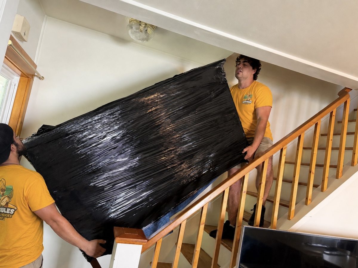
Everything on the site that is not type is a photograph of our people doing the job. These three are from the homepage.
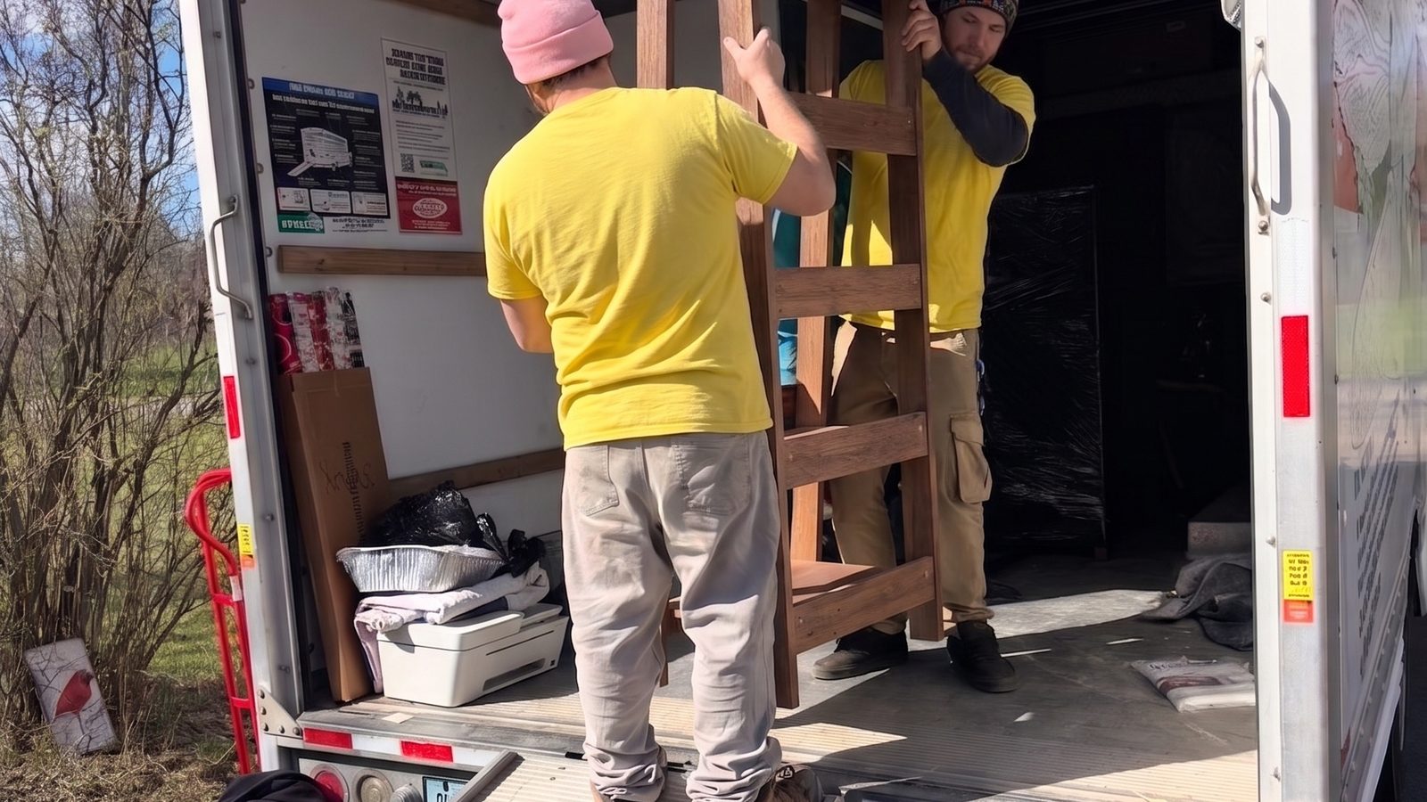 Loading, mid-lift. The wrapped frame says more about blankets and shrink wrap than a paragraph would.
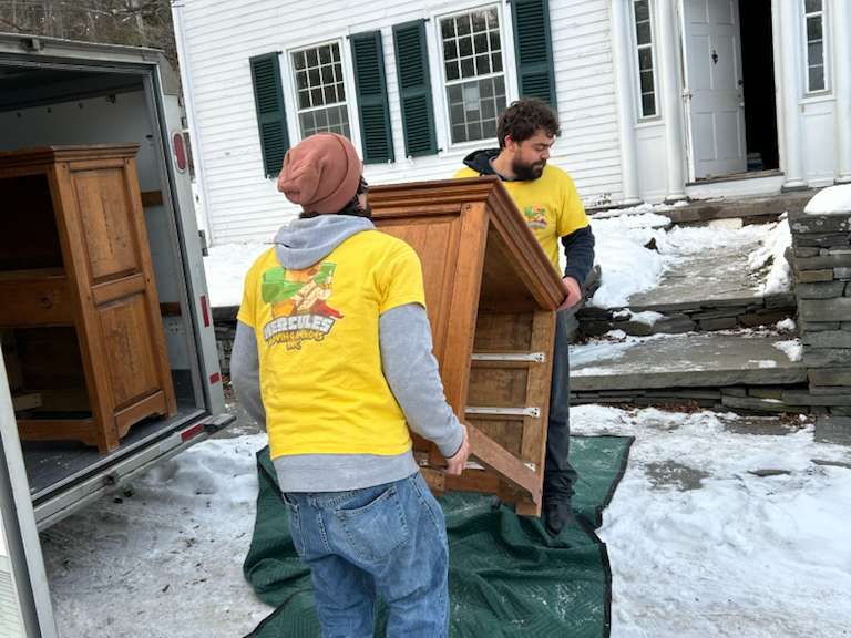 Snow on the ground. Weather is the easiest way to prove a photo was not bought.
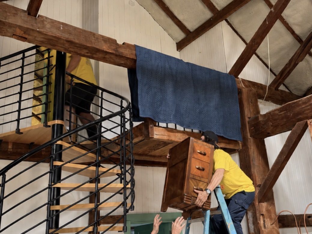 A spiral staircase in a barn. The jobs people are nervous about are the ones to show.
- 1Real crew, real jobs, or nothing. No stock. Not one smiling family in an empty apartment, not one pair of hands passing a box. A customer has seen that photo on forty sites and knows it is not you. One real photo of your crew carrying a wrapped dresser does more than the whole stock library.
- 2Mid-job beats posed. Thumbs-up photos are charming and we have plenty. We use one. The rest of the page is people carrying things, because that is what the customer is paying for.
- 3Built for vertical photos. Nearly every phone photo is portrait. The page is laid out for that, with photos beside the type, instead of cropping them into a wide banner that ruins every one of them.
- 4No filters, no color wash, no fade. Photos run at full strength. If text has to sit on one, it sits on a solid block, not a gradient. Working photography of people doing hard things is more persuasive than anything you can do to it.
Section 5
The proof is one line, not a row of badges.
Licensed & insured · NYS DOT and USDOT numbers in the header · Workers' comp on every crew member through NYSIF · 5.0 on Google across 140+ reviews
- 1Only facts a customer can check. Licensed, with the number on the page where they can look it up. Workers' comp on every crew member, so an injury on the job never lands on the customer's homeowners policy. That one sentence closes more jobs than any badge.
- 2The rating, linked to Google. Pull the number onto the page and send them to the profile. The customer believes Google, not your screenshot of Google.
- 3No logo soup. No BBB badge, no "as seen on", no five-star graphic you drew yourself. If an element would look the same on an insurance agent's site, it is off ours.
Section 6
The pages that make the phone ring.
The homepage does the convincing. These pages do the finding. Each one answers one search, with the price on it.
- 1
One page per service
Local moves, labor-only loading and unloading, packing, specialty items, long distance and the city-to-upstate run. Someone searching "piano movers" lands on the piano page, with the piano price on it, not on the homepage.
- 2
One page per town
Five counties and about forty towns, each with the drive from the shop and what that does to the clock. Honest about distance, which is the thing a customer two counties over is worried about. The list is longer than the services menu, on purpose.
- 3
The estimator
What is moving, from where, to where. A number comes back with the drive from the shop already counted. It is the page the customer sends to their spouse, and the reason the phone rings with people who already know the price.
- 4
About, by first name
The crew, the trucks, the shop. Who is going to show up. It is the second most visited page on the site and it has no slogan on it.
What we left out
Everything that would look the same if we sold insurance.
Most of designing this site was saying no. If a layout decision could be traced to "that is how every mover does it," it needed a better reason, and usually did not have one.
- The full-bleed hero with white text and "Get a Free Quote". Every mover in the country has that page. The customer has already scrolled past it twelve times today.
- Identical rounded cards for every block. Services, reviews, why-choose-us, all in the same grey card. The page stops having a shape.
- Trust badges, star widgets, logo soup. See section 5. One line of facts, linked where they can be checked.
- A chat popup. The text button is the chat, and it goes to a phone that answers.
- "Seamless," "stress-free," "peace of mind," "we've got you covered." If a sentence could be on a plumber's site, it is not on ours.
- A nine-field quote form. Nobody fills it in at nine at night. They text, or they leave.
Do it yourself
The checklist, in order.
Any builder will do. The structure is what matters, and it is the same structure whether the site is one page or twenty.
- 1Settle your rates first. Run the calculator with your wages, your truck and your market. The site cannot be built until you can say what a two-bedroom costs.
- 2Write the clock paragraph. When it starts, when it stops, the minimum, and when the cheaper option is better. Five sentences, no terms page.
- 3Put the table and the clock on the first screen. Name, number, rates, clock. Check it on your own phone before anything else goes on the page.
- 4Make the main buttons a text and a call. Links that open a message or dial your number, in the header of every page. An estimator can come later; the text button cannot.
- 5Three real photos, mid-job. The crew carrying a wrapped piece, the truck with your name on it, the inside of a loaded truck. Vertical is fine. Shoot on the next job if you have none.
- 6One proof line. Licensed, insured, the Google rating linked to Google. Nothing you cannot back up with a document.
- 7One page per service and per town. Add them as you add the service or start getting calls from the town. The price goes on every one.
- 8Read it on your phone, slowly. If the number and the rates are not on the first screen, start over.
Module 11 of the course walks this list page by page, with the files. If you would rather we did it, we build moving company sites this way, and the prices are on the page: $750 for a one-page launch site, $2,500 for the full build, and a monthly fee that covers hosting and your rate changes.
Published rates are the whole idea.
Everything else on the page exists to make the number believable. See it live, build it yourself from the checklist, or send us your rates and we build it the way we built ours.
No rates yet? Start with the pricing page, then the calculator in the course. The site cannot be built without rates.